
Your Marketo forms don’t have to be boring. With a little extra CSS you can create beautiful Marketo forms with customized checkboxes and radio buttons. In this tutorial, I’ll show you how you can style checkboxes and radio buttons within Marketo forms with minimal coding.
Before we begin…
Let’s refresh on how to add custom CSS to your Marketo forms.
Navigate to the form and open up the form editor. Click on Form Settings > Form Theme > Edit Custom CSS this is where you can paste in your own CSS.
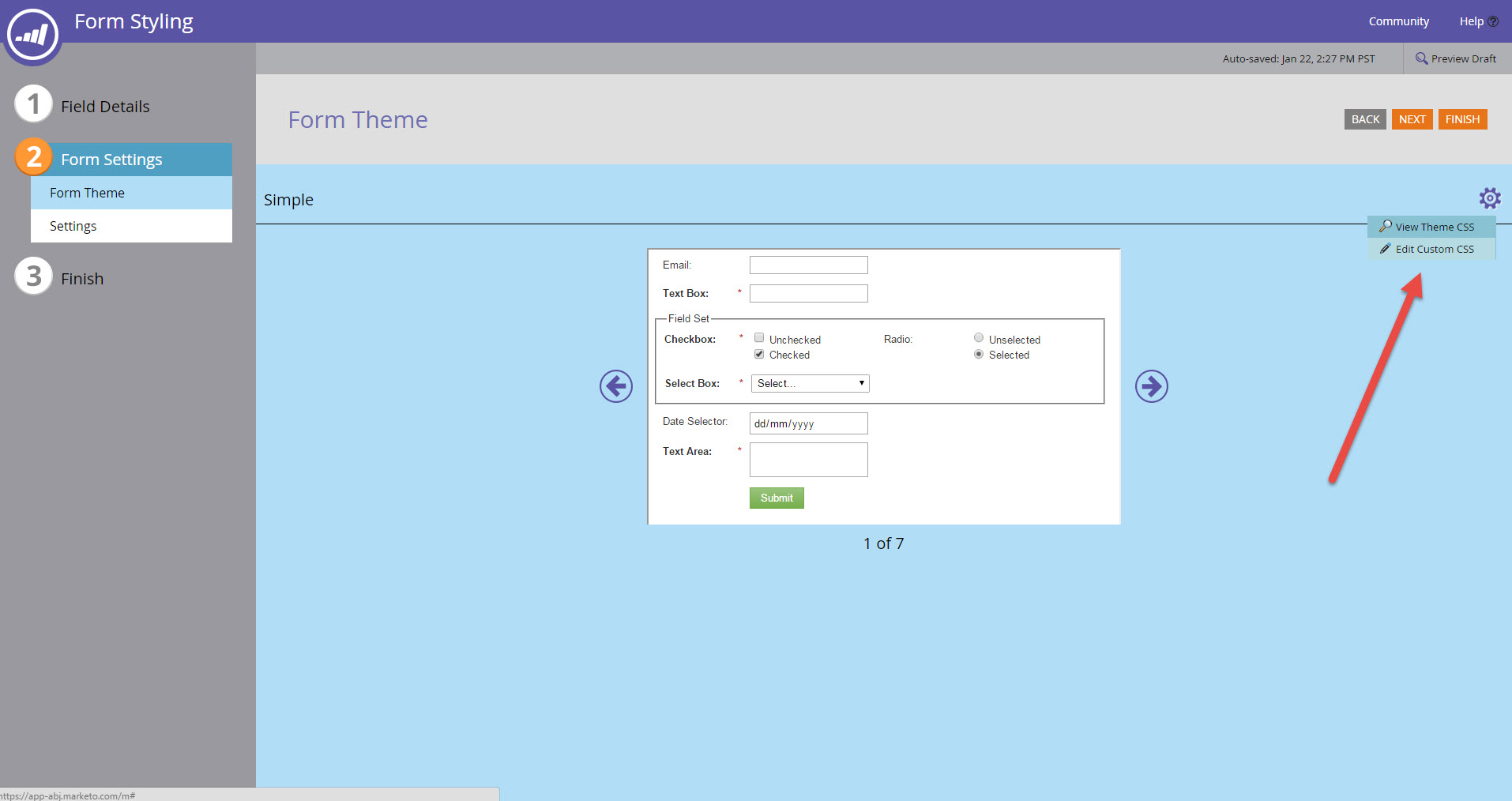
Marketo requires that you select one of their themes to start. Changing themes will affect the CSS. For this tutorial, I will be using the “simple” theme which is the default theme when you create a new form.

Note: If you don’t select the “simple” theme for your form this tutorial won’t be copy & paste.
Styling Checkboxes
One of the downsides of using Marketo forms is the inability to modify the HTML structure of the form, so I will be leveraging the standard Marketo HTML to style the checkboxes.
The HTML
The standard HTML for a checkbox in a Marketo form looks like this:
<div class="mktoLogicalField mktoCheckboxList mktoHasWidth" style="width: 150px;">
    <input name="select-1" id="mktoCheckbox_46078_0" type="checkbox" value="Checkbox 1" class="mktoField">
    <label for="mktoCheckbox_46078_0">Checkbox 1</label>
    <input name="select-1" id="mktoCheckbox_46078_1" type="checkbox" value="Checkbox 2" class="mktoField">
    <label for="mktoCheckbox_46078_1">Checkbox 2</label>
</div>
Notice how the all the checkboxes are wrapped in a DIV with the class mktoCheckboxList? This is how we will target the checkbox input and the checkbox label within the CSS.
The CSS
For the CSS, FontAwesome will be loaded to display the checkmark for the checkbox. The default checkbox will be hidden and the ::before selector will be used to style the new checkbox.
/* Load FontAwesome to create a pure CSS checkbox */
@import url('//maxcdn.bootstrapcdn.com/font-awesome/4.7.0/css/font-awesome.min.css');
.mktoCheckboxList input {
    opacity: 0;
    position: absolute;
}

.mktoCheckboxList input, .mktoCheckboxList label {
    display: inline-block;
    vertical-align: middle;
    margin: 5px;
    cursor: pointer;
}

.mktoCheckboxList label {
    position: relative;
}

/* Edit the properties below to change the colors of the un-checked checkbox */
.mktoCheckboxList input + label:before {
    content: '';
    background: #fff;
    border: 2px solid #ddd;
    display: inline-block;
    vertical-align: middle;
    width: 15px;
    height: 15px;
    padding: 2px;
    margin-right: 10px;
    text-align: center;
}
/* Edit the properties below to change the colors of the checked checkbox */
.mktoCheckboxList input:checked + label:before {
    content: "\f00c";
    font-family: 'FontAwesome';
    background: #56CFD2;
    color: #fff;
    border-color:#3eb9bc;
}

body .mktoForm .mktoCheckboxList > label {
	margin-left:0;
}
The Result
The styled checkboxes will look like this once the CSS has been added to the Marketo form.
See the Pen Marketo Customized Checkboxes Using CSS (option 1) by Jenna Molby (@jennamolby) on CodePen.
Styling Radio Buttons
Styling radio buttons are pretty similar to the checkboxes, but with a bit of extra CSS to make them look like a radio button. Just like the checkboxes, we will leverage the HTML that Marketo provides, so all you have to do is add some CSS.
The HTML
All radio buttons in the Marketo form are wrapped in a DIV with the class mktoRadioList. This is how we will target the radio input and the radio label within the CSS.
<div class="mktoRadioList mktoHasWidth" style="width: 150px;">
    <input name="my-field" id="mktoRadio_46079_0" value="Radio 1" type="radio" class="mktoField">
    <label for="mktoRadio_46079_0">Radio 1</label>
    <input name="my-field" id="mktoRadio_46079_1" value="Radio 2" type="radio" class="mktoField">
    <label for="mktoRadio_46079_1">Radio 2</label>
</div>
The CSS
Just like the CSS for the checkboxes, FontAwesome will be loaded to display the checkmark for the radio button and the default radio button will be hidden.
/* Load FontAwesome to create a pure CSS checkbox */
@import url('//maxcdn.bootstrapcdn.com/font-awesome/4.7.0/css/font-awesome.min.css');

.mktoRadioList input {
    opacity: 0;
    position: absolute;
}

.mktoRadioList input, .mktoRadioList label {
    display: inline-block;
    vertical-align: middle;
    margin: 5px;
    cursor: pointer;
}

.mktoRadioList label {
    position: relative;
}
/* Edit the properties below to change the colors of the un-checked radio button */
.mktoRadioList input + label:before {
    content: '';
    background: #fff;
    border: 2px solid #ddd;
    display: inline-block;
    vertical-align: middle;
    width: 15px;
    height: 15px;
    padding: 2px;
    line-height:15px;
    margin-right: 10px;
    text-align: center;
}

.mktoRadioList input + label:before {
    border-radius: 50%;
}
/* Edit the properties below to change the colors of the checked radio button */
.mktoRadioList input:checked + label:before {
    content: "\f00c";
    font-family: 'FontAwesome';
    color: #bbb;
}

.mktoRadioList input:focus + label {
  outline: 1px solid #ddd; /* focus style */
}


body .mktoForm .mktoRadioList > label {
	margin-left:0;
}
The Result
See the Pen Marketo Customized Radio Buttons Using CSS (option 1) by Jenna Molby (@jennamolby) on CodePen.
Special thanks to Karen Menezes who wrote a great tutorial on pure CSS checkboxes, which I referenced to make this Marketo tutorial.
Questions?
Send them to me via email, send me a tweet @jennamolby, or leave a comment